ux/ui designer • Caravelo • web • 2024
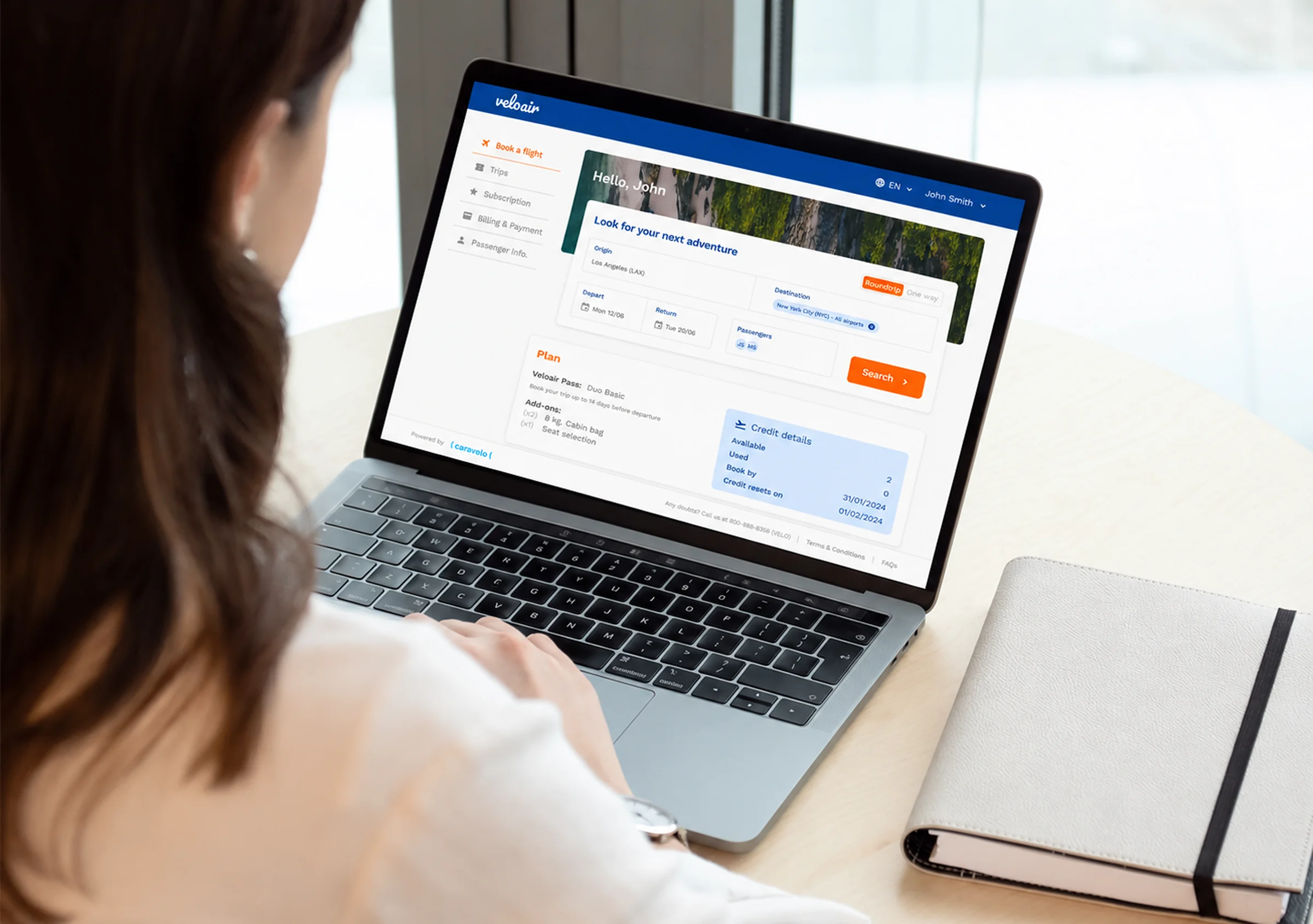
travel search | +8 pts NPS
Redesigning airline subscription booking around when subscribers can fly, not just where.
Travel products benchmarked
New search capabilities shipped
New sales conversations with prospective airline partners
NPS increase in the first 4 months after launch
tl;dr
Caravelo’s booking flow was built for people buying a single ticket, not for subscribers who fly again and again. On the all-you-can-fly plan, subscribers only have a short window to book, so what they most need to know is when they can fly, not just where. I was the only designer, working with a PM and two web engineers, with customer success joining our workshops. I redesigned search around availability: a date-first “Fly Anywhere” search, several destinations in one search, a calendar that explains why a date can’t be booked, and reminders to use remaining trips. It launched with Wizz Air, and NPS went from 54 to 62 in the first 4 months.
overview
Caravelo builds white-label subscription products for airlines, letting travellers pay a recurring fee to fly within a set quota of trips.
Booking is where subscribers actually use what they pay for, but the flow had been designed for one-off purchases, not for people who fly regularly.
The goal
Help subscribers quickly find trips they can actually book, so they use their subscription more and are less likely to cancel.
problem
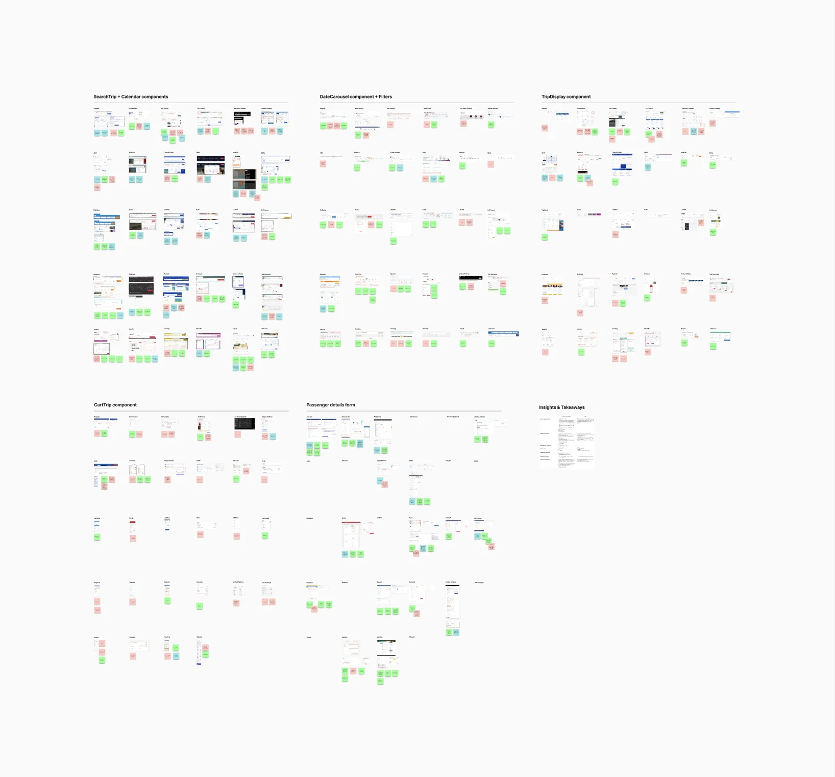
I mapped the existing booking journeys and benchmarked more than 30 travel products to see how others handle search, calendars and booking summaries.
- Search started from the destination. With a short booking window, when subscribers could fly mattered more than where, but search made them pick a destination first.
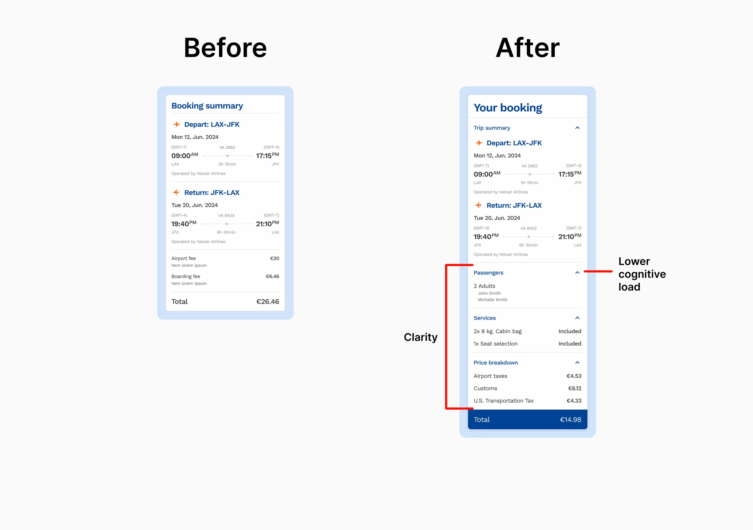
- Unclear availability. The calendar didn’t explain why a date couldn’t be booked, and booking conditions were hard to find.
- Unused trips. Subscribers struggled to use their pass as much as they wanted, which left them frustrated, unsure it was worth it, and more likely to cancel.
discovery
I was the only designer, working with a PM and two web engineers. I ran workshops with them and the customer success team to define personas and map booking journeys, and held design critiques with the product team.
Why booking had to work differently
On the all-you-can-fly plan, subscribers can only book within a short window before departure, so availability shapes the trip more than destination does. Subscribers who couldn’t use their pass as much as they wanted got frustrated, stopped seeing its value and were more likely to cancel. So the booking flow had to help them find what they could book, fast, and remind them to use their trips.
design decisions
Most of these changes start from the same fact: subscribers on this plan are looking for a seat they can get, not a ticket to one particular place.
-
Search by date, not destination
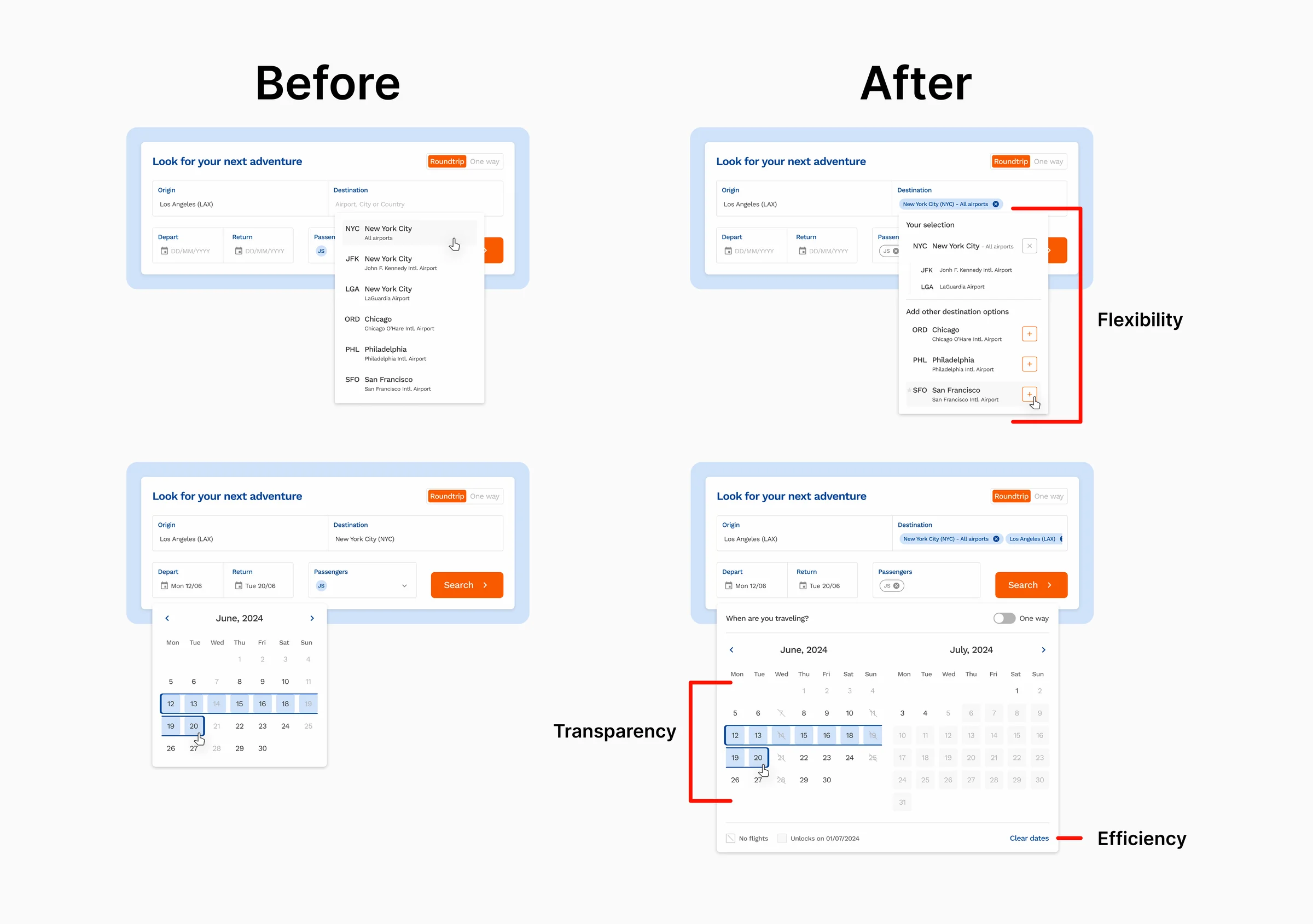
With a short booking window, many subscribers care more about when they can fly than where. “Fly Anywhere” lets them pick their dates and see where they can go, instead of trying destinations one at a time.
-
Fewer repeated searches
Search remembers the last airport used as the origin, so regular travellers don’t have to enter it every time. Subscribers can also search more than one destination at once, so comparing options doesn’t mean running the same search again.
-
A calendar that explains itself
The calendar now shows why a date can’t be booked, with labels like “no flights” or “becomes available on…”, and the subscriber’s remaining trips stay visible throughout the flow, so they know what they can book before they commit.
-
Booking reminders
Subscribers who used their pass less than they wanted were the ones most likely to cancel. Reminders nudge them to book their remaining trips, so they get the value they’re paying for.
-
Built on Veloair
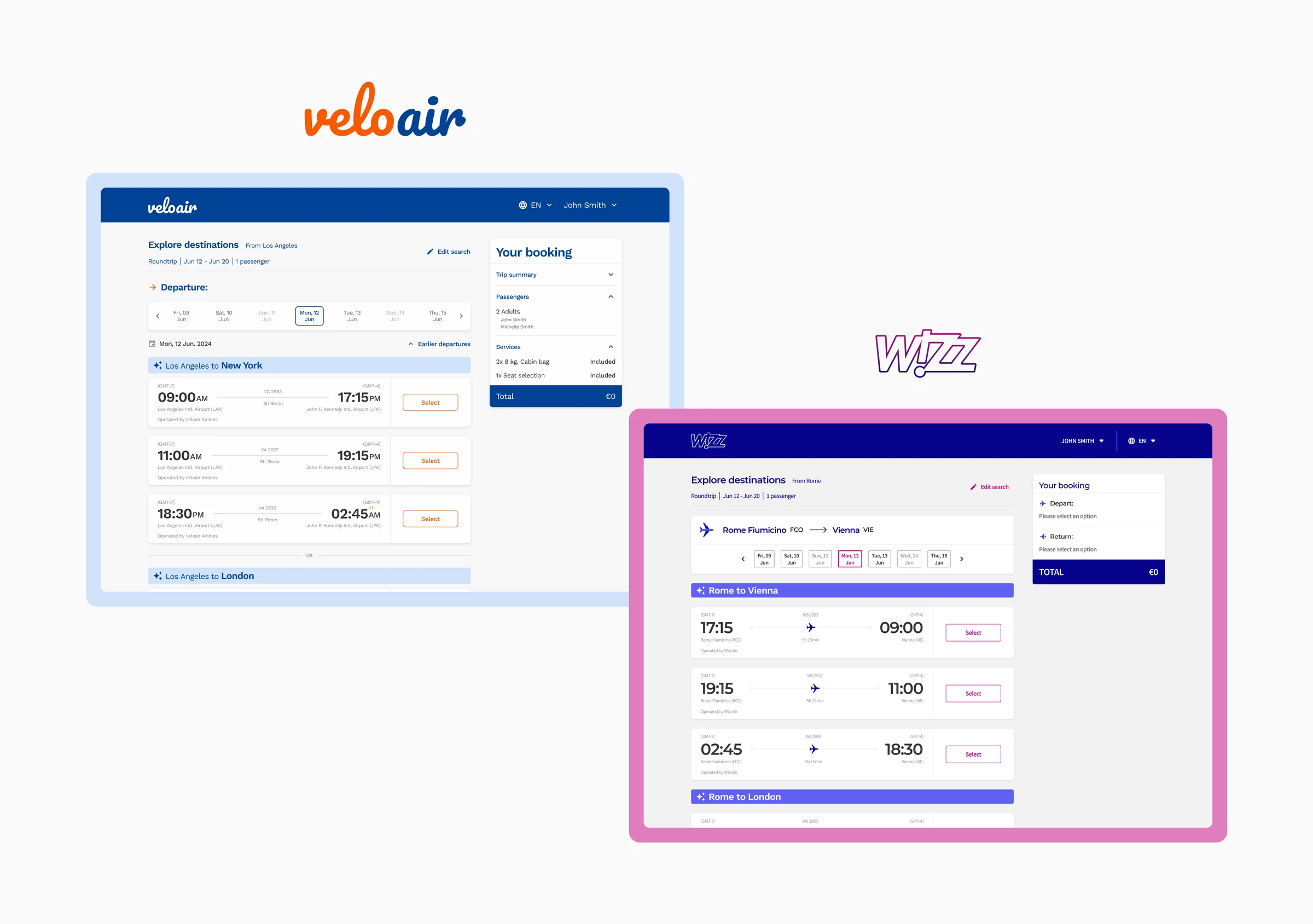
I built the new search on Veloair, the design system I’d made the year before, so every airline partner gets the same flow in its own branding. The Wizz Air version below is the same screens with Wizz Air’s look.
validation
I ran one round of unmoderated testing on Maze with 5 participants, who went through the redesigned flow. It confirmed the main direction and pointed out a few fixes.
-
Favourite airports
Participants really liked being able to mark an airport as a favourite. → We left it out of the MVP to keep the scope manageable, but it’s a strong candidate for the next version.
-
Passenger selection
Removing a passenger meant reopening the autocomplete, which added unnecessary steps. → We let users remove passengers directly from the input field.
challenges & trade-offs
-
A traffic-light calendar
My first version of the calendar used traffic-light colours for availability: green for plenty of seats, yellow for normal, red for only a few. But getting that much detail from the airlines’ APIs for every date made the calendar load too slowly.
-
Choosing speed over detail
We switched to a simple available / not available indicator. Subscribers lose some detail, but the calendar loads quickly, and for someone with a short booking window, a fast answer matters more than a detailed one.
impact
-
Happier subscribers
NPS rose from 54 to 62 in the 4 months after launch. Subscribers said search now worked more like the booking sites they already used.
-
Launched with Wizz Air
The first version, including Fly Anywhere, launched with Wizz Air.
-
New business opportunities
Caravelo used my designs in sales pitches, which opened conversations with 3 prospective airline partners.
see other projects
couple onboarding | targeting +16% completion
See project →
subscription management | −27% tickets
See project →
wedding vision | AI prototype
Case study coming soonwant to connect?
whatsapp, email, or linkedin — whatever's easiest for you