sr. product designer • The Knot • iOS & web • 2026
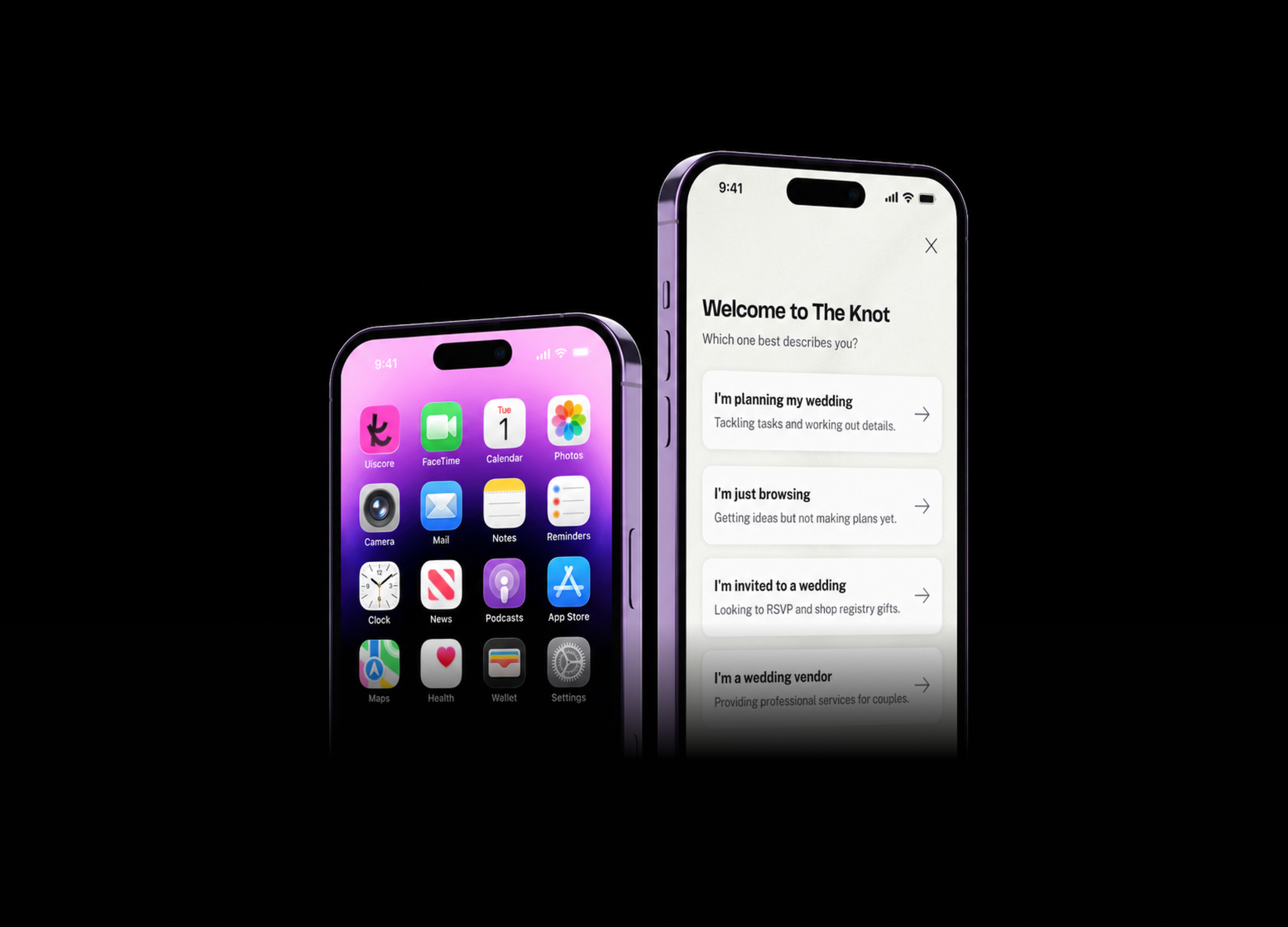
couple onboarding
Redesigning sign-up and onboarding to reduce drop-off, improve data quality, and drive early activation.
Pre-redesign sign-up drop-off
Components contributed to the design system
Onboarding completion — Web
Onboarding completion — iOS
tl;dr
A ~70% sign-up drop-off rate, a one-size-fits-all flow, and a homepage that ignored everything users had just shared. I led the full redesign of The Knot’s onboarding: introducing intent routing to fork users correctly from the first screen, restructuring the sign-up moment to follow demonstrated value, and building the data foundation for a personalised first session. The direction was validated through two rounds of unmoderated user testing with real users before moving into development, with AI woven into every stage to move faster from research to prototype to insight. Currently in A/B testing, targeting an 11–16% relative lift in onboarding completion across web and iOS, while holding CPA and account quality neutral or better.
overview
The Knot is one of the leading wedding planning platforms in the US, helping couples navigate every step of their wedding — from finding vendors to managing guests and tracking details.
Onboarding is the product’s front door. But it wasn’t working — we were losing users before it had a chance to show them what The Knot could do.
The goal
Reduce drop-off, collect the right data at the right moment, and leverage it to drive couples toward their first core planning actions (CPA).
problem
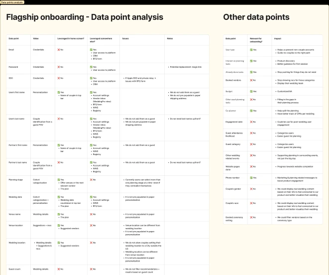
Before designing a new experience, I analyzed quantitative drop-off data, UXR findings, and past experiment performance to identify why the current onboarding flow was falling short. To get up to speed quickly on years of existing studies, I used AURA, our internal AI-powered UXR tool, to digest past research and surface recurring patterns.
- Users had fundamentally different needs from the first screen — the flow was optimised for no one in particular.
- The sign-up modal created a value exchange problem: commitment before context.
- Guests and vendors were invisible — no meaningful routing existed for non-couple users.
- Providing a wedding date increases down-funnel CPA conversion by +59%. In the current flow, wedding date is optional and placed late, resulting in -50%+ of users skipping it. This breaks downstream personalization for checklists, countdowns, and CRM retargeting.
- Users were willing to share data, but expected it to be used. Ignoring it damages trust.
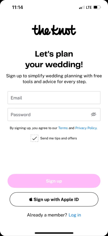
sign up modal displayed right away, no way out for guests or vendors
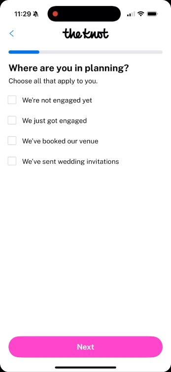
confusing categories and allowing contradictory options to be selected at once
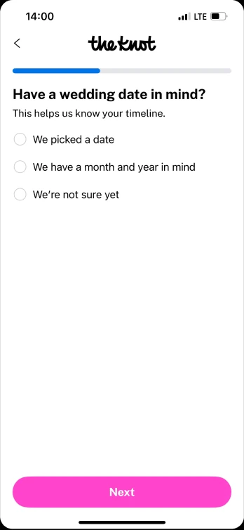
not enough flexibility for users that were not sure about their wedding date yet
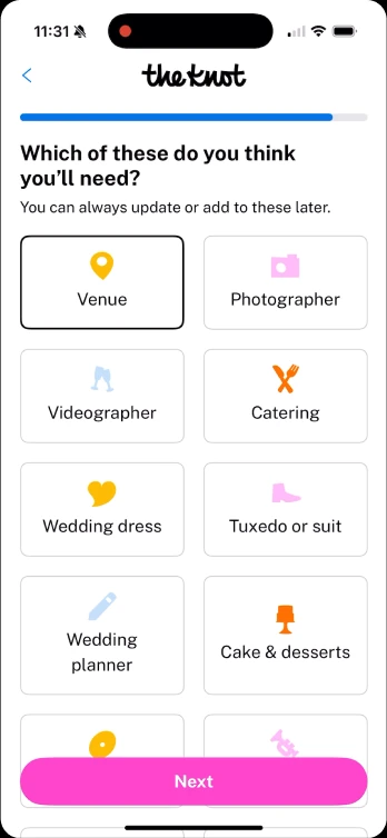
not all vendor categories were displayed and data collection was not granular enough
discovery
I led the design end to end alongside PMs, UXR, UXW, and design and product directors. I conducted a competitor analysis across consumer and B2C onboarding patterns and ran internal critique sessions. To keep iteration cycles short, I used Figma Make and Figma’s AI agent to draft UIs and prototypes fast, so ideas could be explored, critiqued, and tested before investing in high-fidelity design.
Hypothesis: quality over quantity
Shifting from “fill out this form so we can market to you” to “tell us what you want to do, and we’ll build your planning workspace around it” reduces onboarding drop-off, increases the quality of couple profiles, and drives higher first-session CPA conversion by immediately routing couples to the experience most relevant to them.
Onboarding is pre-work — its primary job is to understand couples. It doesn’t drive CPAs on its own; it feeds the homepage and Next Best Action (NBA) engines, which will execute the activation.
The optimisation target is lead and account quality rather than raw sign-up volume: non-couple traffic (guests and vendors) is actively routed out of the planning funnel to dedicated experiences.
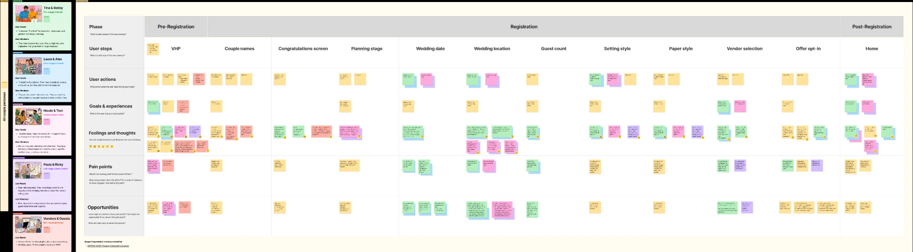
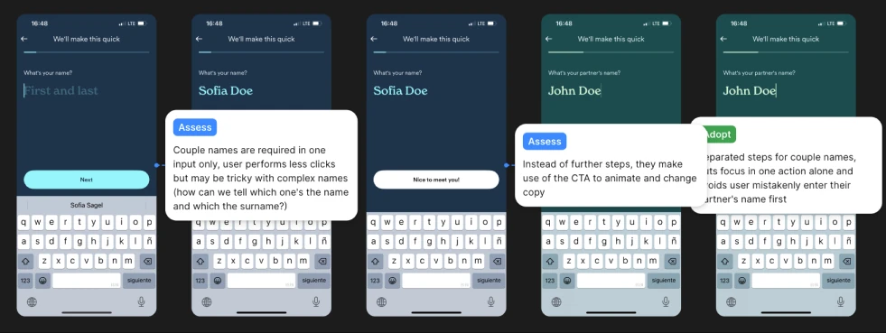
design decisions
One principle guided everything: establish who the user is before asking them to do anything.
-
Intent routing as the first screen
“Which one best describes you?” replaces the sign-up form. Vendors and guests are redirected immediately. Couples proceed into a tailored sequence. No friction in testing — and the “Just browsing” option measurably reduced sign-up anxiety.
-
Earning the sign-up
Account creation now comes after names and wedding date are collected — demonstrating value before asking for commitment. This also resolved a CRM dependency: wedding date determines which email sequence a user enters, and had to exist before account creation could trigger it.
-
The right data, at the right granularity
Wedding date moved to flexible month-and-year input, fixing a backend constraint that stored flexible dates as exact values. Venue and location were separated, with international location now supported — closing the gap for the 12% planning destination weddings. Guest count moved to a range selector. A vendor booking status step, initially cut for complexity, was simplified to “no / not sure / yes” and retained for the A/B test.
-
Connecting to the homepage
Data flows into a wedding OS that powers personalisation across the product. The homepage redesign is ongoing, but the foundation is in place to surface relevant CPAs from the moment users land.
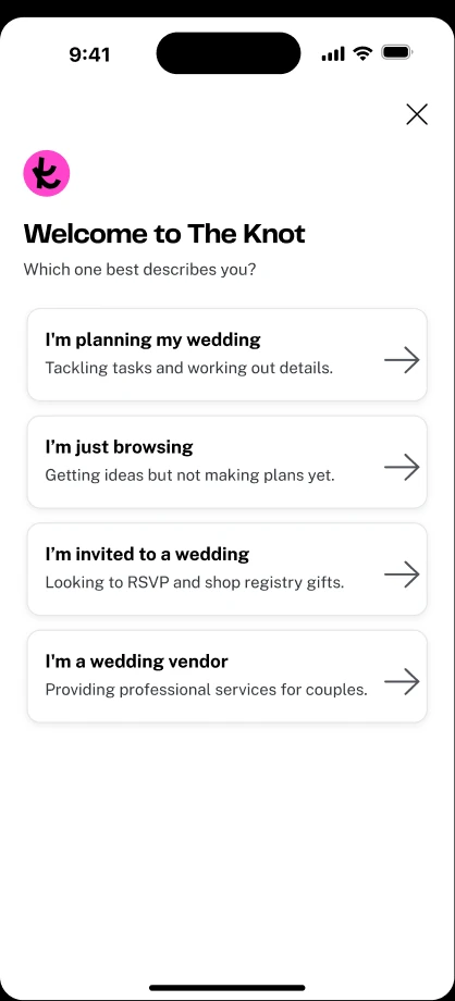
Offering a way out for guests and vendors that do not need to create an account and therefore aiming to reduce onboarding abandonment rates resulting in better quality sign ups over focusing on quantity
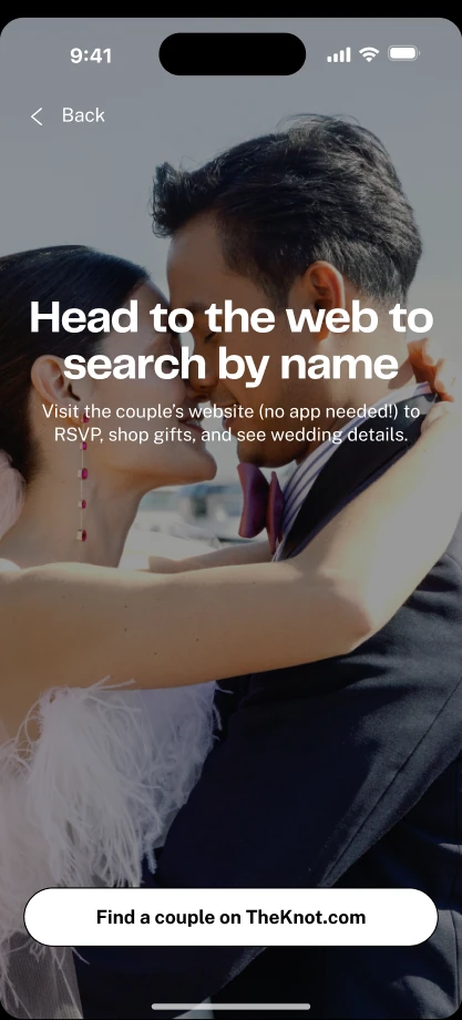
guest opt-out, redirects to the find a couple site

vendor opt-out, redirects to the sub brand focused on wedding professionals
smoother transitions and more aligned with the new brand refresh
allowing multi-select across months and years to reduce step drop-off rates
capturing intent and taking advantage of pushing product discoverability
displaying all vendor categories and offering more granularity on need level
validation
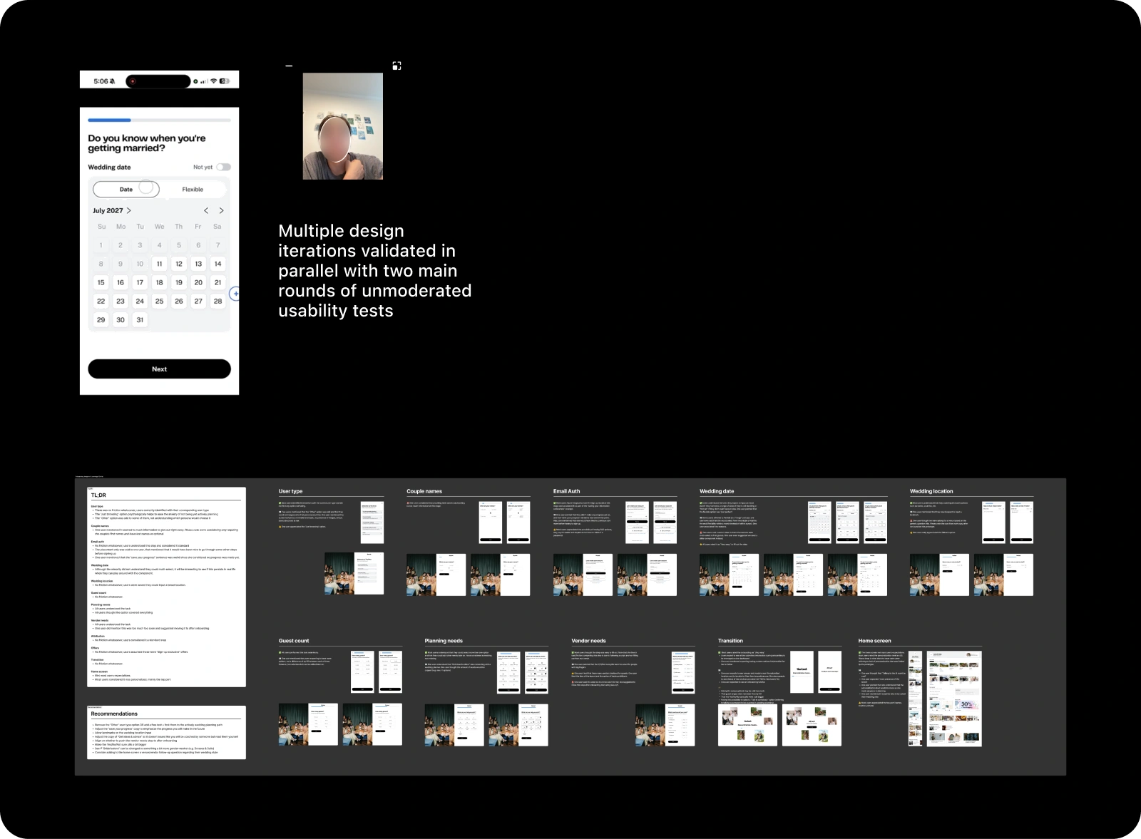
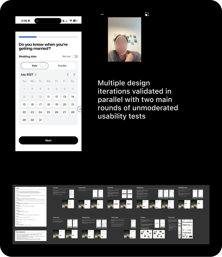
Two rounds of unmoderated testing, with 10 participants per round (5 on iOS and 5 on web), worked through the new flow step by step, surfacing what held up, what needed to change, and what’s worth watching after launch. I used NotebookLM to digest the session recordings and notes from each round, making it faster to synthesise findings across platforms and turn them into recommendations.
-
User type
Zero friction. “Just browsing” effectively reduced user commitment anxiety, while the “Other” option caused confusion. → We decided to remove that option.
-
Couple names
Asking for full names upfront felt premature to some users. → We later reduced friction by making last names optional and prioritising first names only.
-
Email auth
Generally treated as standard, but one user questioned the timing of the sign-up step. → We moved it to after the wedding date question.
-
Wedding date
High completion overall, though a small minority missed the multi-select capability. → We’re monitoring real-world interaction data post-launch to see if the UI or copy needs adjusting.
-
Wedding location & guest count
Seamless execution with zero friction — users clearly understood the broad location search and the standard guest-count input. → We took this as proof that the adjustments made after the first round of testing were the right ones.
-
Planning & vendor needs
Core task comprehension was high across both steps. However, vendor selection felt “too much too soon” for one user, pointing to a possible move to post-onboarding progressive profiling. → We’re monitoring real-world interaction data post-launch to see if it should move there.
-
Attribution & offers
Zero friction. Users read both as standard onboarding steps and perceived the offers as exclusive sign-up perks. → That said, we’ll be closely monitoring performance on the new designs to see whether revenue moves up or down.
-
Home screen & transitions
Transitions were seamless and the home screen met expectations — users in particular felt the top hero section was personalised to their needs. → That said, we decided the home screen redesign deserved a project of its own.
challenges & trade-offs
-
Rescoping mid-project
The project originally included redesigning the homepage alongside onboarding. Partway through, it was clear that was too much ground for one project, so we split it in two: onboarding (this case study) and a homepage redesign that hasn’t started yet. That split also forced a rethink of what success meant — measuring it as a lift in Core Planning Actions (CPA) no longer made sense without the homepage doing its part to surface them. We shifted to onboarding completion instead, alongside a deliberate decrease in sign-ups (the direct result of routing guests and vendors out of the flow) and a decrease in dormant accounts.
-
A trade-off on the flexible wedding date
The flexible wedding-date feature was originally scoped to support a wide range of scenarios — sequential months in the same year, sequential months across different years, the same month across different years, and more. A miscommunication with the dev team meant we had to cut that down to two supported scenarios: sequential months within the same year or across different years, and the same month across different years. It’s a smaller set than planned, but still a real improvement in flexibility over the current single fixed-date experience.
status & next steps
Currently in A/B testing.
How we will know we succeeded
Success is measured primarily through onboarding completion, with CPA and account-quality signals tracked as guardrails and informative context rather than the primary gate:
| Metric | Current | Target | Relative lift | Type |
|---|---|---|---|---|
| Onboarding completion — Web | 54% | 60% | +11% | Decision |
| Onboarding completion — iOS | 63% | 73% | +16% | Decision |
| Mean uncapped CPA (14d) | Baseline | Neutral or ↑ | Must not drop | OKR — Decision |
| 30-day new couple activation rate | Baseline | Neutral or ↑ | Must not drop | Informative |
| Sign-up volume | Baseline | Monitor | Expect down | Informative |
| Guest metrics (site visits, registry purchases, RSVPs) | Baseline | Neutral or ↑ | Expect up | Informative |
| Vendor metrics (WeddingPro traffic, leads) | Baseline | Neutral or ↑ | Expect up | Informative |
Open questions beyond the test: how effectively the homepage leverages onboarding data to drive CPAs, and whether intent routing can be refined by entry source — users arriving from marketplace or planning tool pages carry different context from the first screen.
see other projects

travel search component
See project →
subscription management
See project →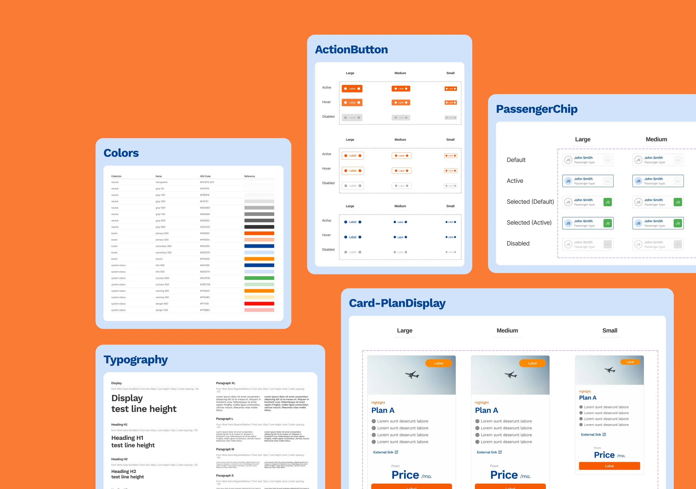
multi brand design system
See project →want to connect?
whatsapp, email, or linkedin — whatever's easiest for you